Services provided
Print
Digital
Packaging
The Blunt Chisel Brewery
Once a woodworker’s studio, before that a sawmill for the Blairadam estate, Phoenix Mill is home to The Blunt Chisel Brewery. Nestled deep in the woods in his hand built 1bbl brewhouse, using three converted fridges and the remnants of a Chinese noodle bar, Roy Herd creates award-winning small batch craft beer.
After meeting Roy, I was tasked with re-branding the brewery and re-designing the labels for the brewery's core bottle range. The historic sawmill in which the brewery is located, provided a wealth of inspiration for the creative solution.
Appearing regularly at farmers markets and festivals, Roy has found that his preferred route-to-market is through bottles rather than casks. I was keen to touch upon this within the new identity. The logo's symbol depicts a cross section of a tree but with the outer bark being formed by the shape of a bottle top.
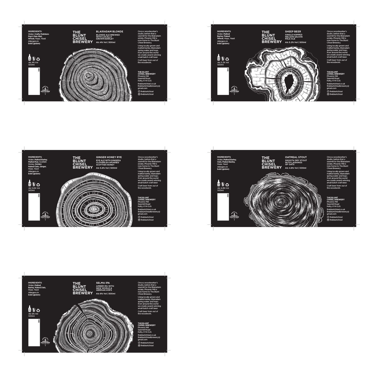
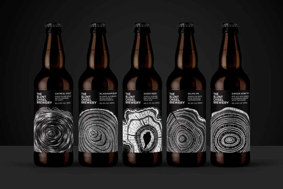
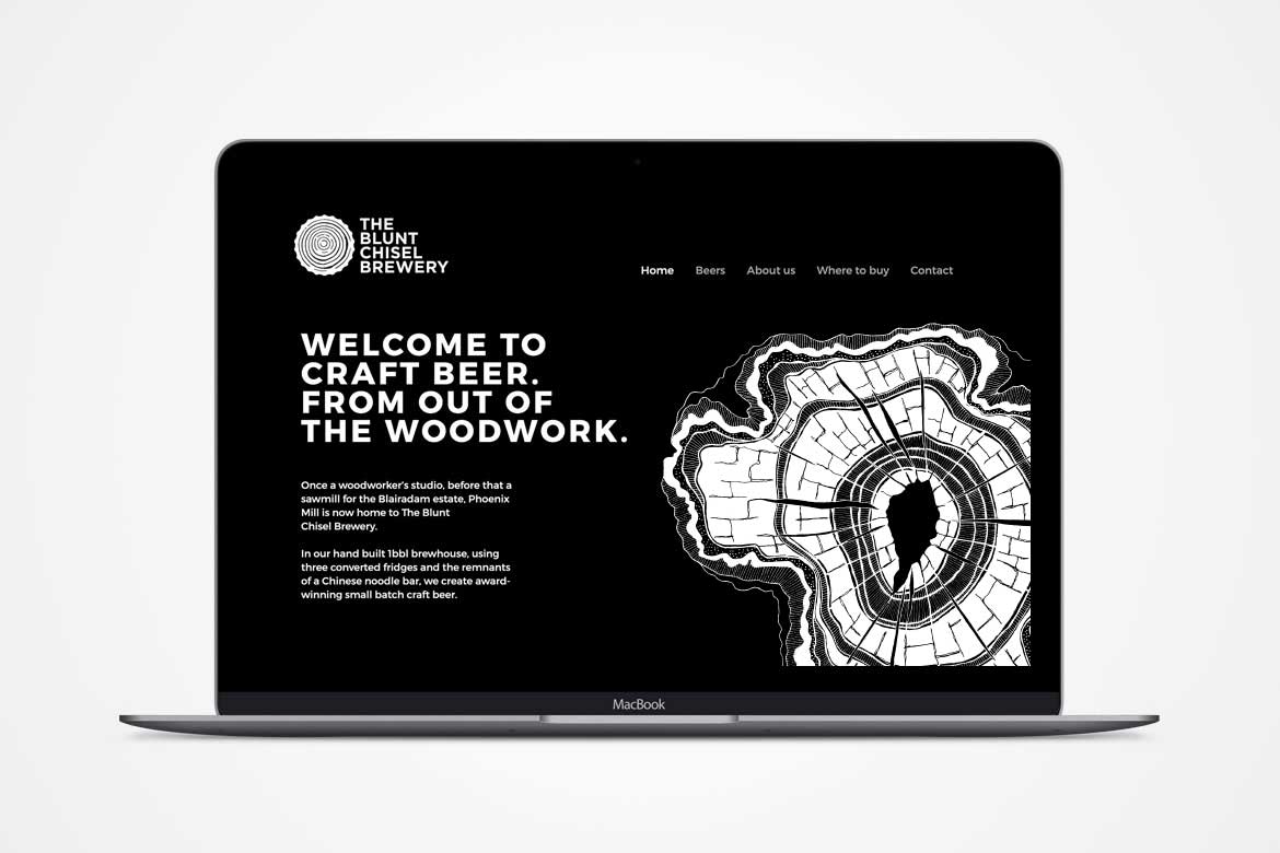
I then created a suite of images inspired by tree-print art to represent each of the five core beers. They worked together alongside a simple typographic style and a timeless black and white colour palette. Further to the re-brand and label re-design I also created pump-clips, a magazine advert, social media imagery and re-skinned the existing website.


Roy Herd
Owner and Brewer
The Blunt Chisel Brewery
"From the start Neil was clear, concise and focused. His professionalism was exemplary and his design work was excellent. Neil has a great feel for understanding and developing a brand whilst offering something new and challenging to push it in new directions. I would highly recommend him."


Need a designer?
Let’s talk.
Registered in Scotland
Company No: 546850
VAT Registration
No: 444 5792 68
© Form by Thought Ltd