Services provided
Research
Brand communications refresh
Visual identity
Design for print
Design for web
Illustration art-direction
Print advertising
Online advertising
Collaboration with
Michael Driver
Services provided
Research
Brand communications refresh
Visual identity
Design for print
Design for web
Illustration art-direction
Print advertising
Online advertising
Collaboration with
Michael Driver
Services provided
Research
Brand communications refresh
Visual identity
Design for print
Design for web
Illustration art-direction
Print advertising
Online advertising
Collaboration with
Michael Driver
Down’s Syndrome Scotland work to help people with Down’s syndrome reach their full potential by providing information and support to them, their families, carers and professionals at whatever age and stage of life.
Over the years, Down's Syndrome Scotland has published quite an extensive library of resources for both people with Down's syndrome and their families and carers. Without ever having established a consistent style of graphic communication, inevitably the national charity's visual tone of voice started to look disjointed. Down's Syndrome Scotland realised this and so I was tasked with refreshing their communications to help establish a new clarity.
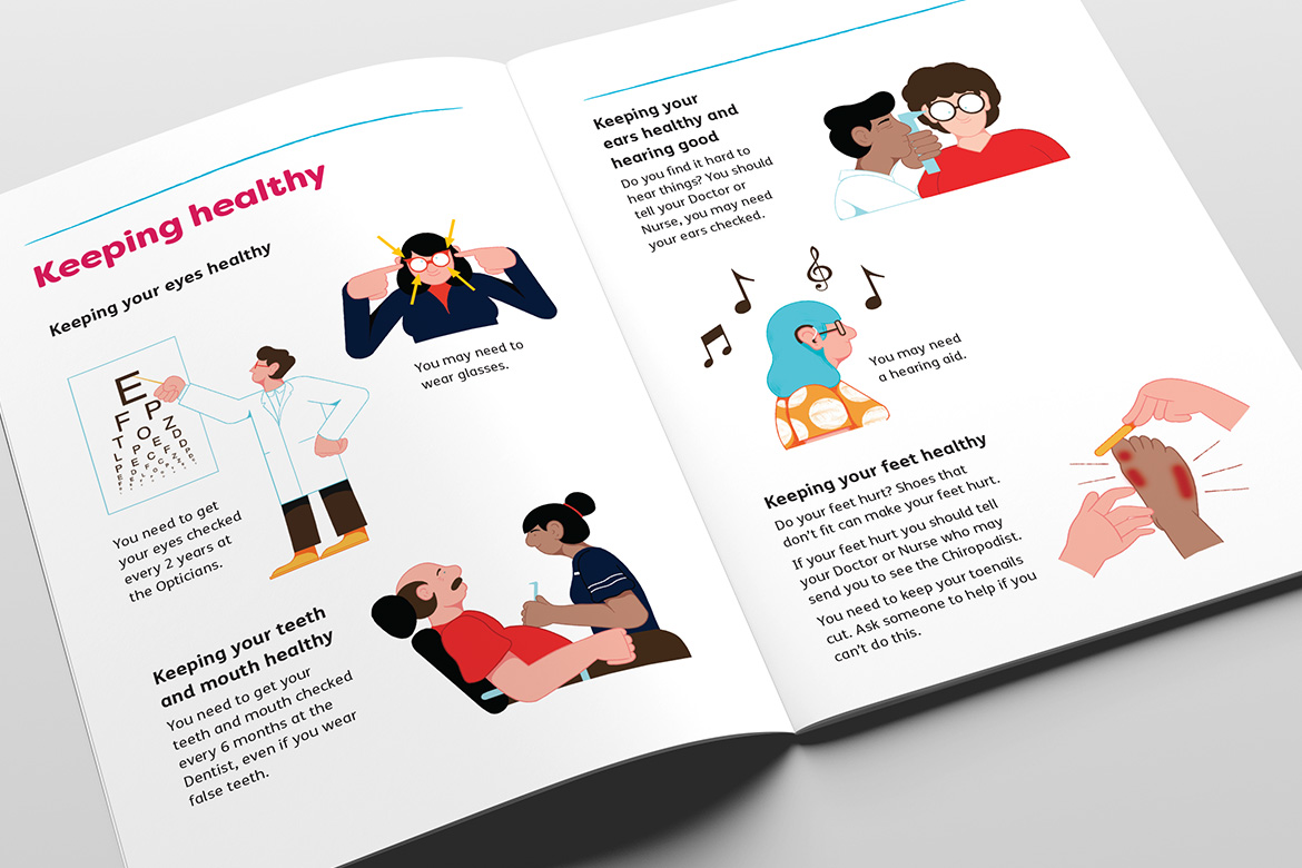
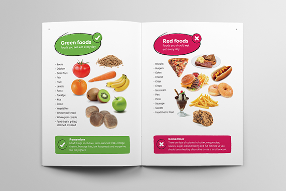
A fresh design approach has been deployed across a variety of communication types. New core brand assets have been created to better engage with the end-user, and a consistent and confident look and feel is now clearly evident.
Down’s Syndrome Scotland work to help people with Down’s syndrome reach their full potential by providing information and support to them, their families, carers and professionals at whatever age and stage of life.
Over the years, Down's Syndrome Scotland has published quite an extensive library of resources for both people with Down's syndrome and their families and carers. Without ever having established a consistent style of graphic communication, inevitably the national charity's visual tone of voice started to look disjointed. Down's Syndrome Scotland realised this and so we were tasked with refreshing their communications to help establish a new clarity.
A fresh design approach has been deployed across a variety of communication types. New core brand assets have been created to better engage with the end-user, and a consistent and confident look and feel is now clearly evident.
Down’s Syndrome Scotland work to help people with Down’s syndrome reach their full potential by providing information and support to them, their families, carers and professionals at whatever age and stage of life.
Over the years, Down's Syndrome Scotland has published quite an extensive library of resources for both people with Down's syndrome and their families and carers. Without ever having established a consistent style of graphic communication, inevitably the national charity's visual tone of voice started to look disjointed. Down's Syndrome Scotland realised this and so I was tasked with refreshing their communications to help establish a new clarity.
A fresh design approach has been deployed across a variety of communication types. New core brand assets have been created to better engage with the end-user, and a consistent and confident look and feel is now clearly evident.
Services provided
Research
Brand communications refresh
Visual identity
Design for print
Design for web
Illustration art-direction
Print advertising
Online advertising
Collaboration with
Michael Driver
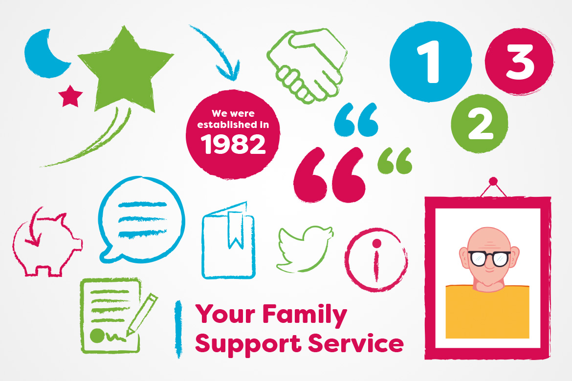
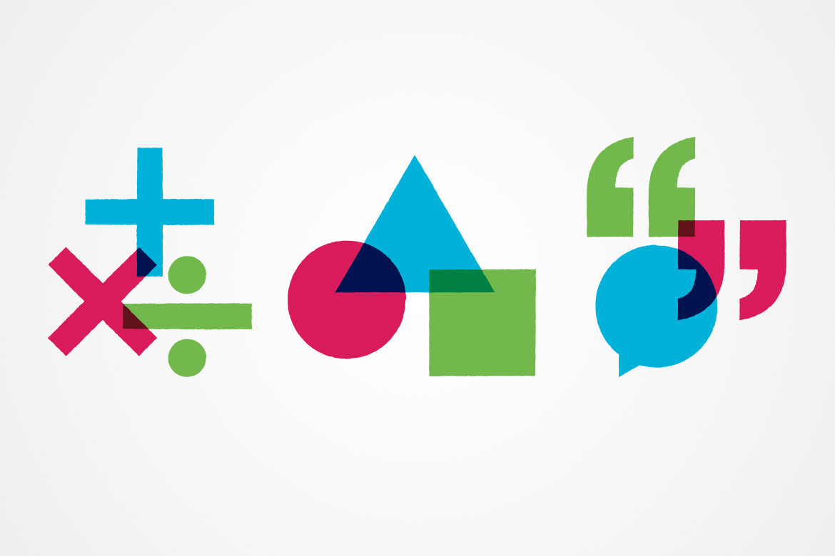
When you really get down to it Down's Syndrome Scotland is all about people. A human voice, human support, the human touch. I felt is was crucial to inject that human touch into the new designs, so I created a suite of brand assets in a hand drawn style that can be used for a range of different applications. They bring warmth and fun to page layouts but also inform at the same time.
Many of Down’s Syndrome Scotland's publications are aimed at people with learning disabilities. They are also likely to be read by people with impaired vision. For people people such as this, reading is made much harder by certain fonts. It was a crucial part of my brief to make sure the new designs were accessible to as many people as possible. I achieved this by using clean, clutter-free layouts and typefaces and point sizes that met RNIB guidelines.
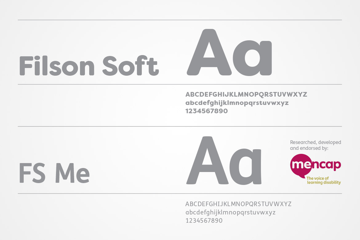
Headline typeface
I chose Filson Soft as Down Syndrome Scotland's headline typeface to give a soft, friendly and approachable feel to the design scheme.
Body copy typeface
For the body copy typeface I selected a typeface called FS Me which was researched and developed with – and endorsed by – Mencap, the UK’s leading charity and voice for those with learning disabilities. Every letter of FS Me was tested for its appeal and readability with a range of learning disability groups across the UK. Its features include very subtle distinguishing elements of each letter to aid the reading and comprehension of texts. It has tails, ascenders and descenders that have been extended for extra clarity.
Many of Down’s Syndrome Scotland's publications are aimed at people with learning disabilities. They are also likely to be read by people with impaired vision. For people people such as this, reading is made much harder by certain fonts. It was a crucial part of our brief to make sure our designs were as accessible to as many people as possible. We achieved this by using clean, clutter-free layouts and typefaces and point sizes that met (and often exceeded) RNIB guidelines.
Headline typeface
We chose Filson Soft as Down Syndrome Scotland's headline typeface to give a soft, friendly and approachable feel to the design scheme.
Body copy typeface
For the body copy typeface we selected a typeface called FS Me which was researched and developed with – and endorsed by – Mencap, the UK’s leading charity and voice for those with learning disabilities. Every letter of FS Me was tested for its appeal and readability with a range of learning disability groups across the UK. Its features include very subtle distinguishing elements of each letter to aid the reading and comprehension of texts. It has tails, ascenders and descenders that have been extended for extra clarity.
It was important to avoid Down's Syndrome Scotland's future communications to again become visually disjointed. To enure against this I designed an extensive Brand Toolkit that DSS staff or their designers could reference to make sure all designs were 'on-brand'. Consistency is key.
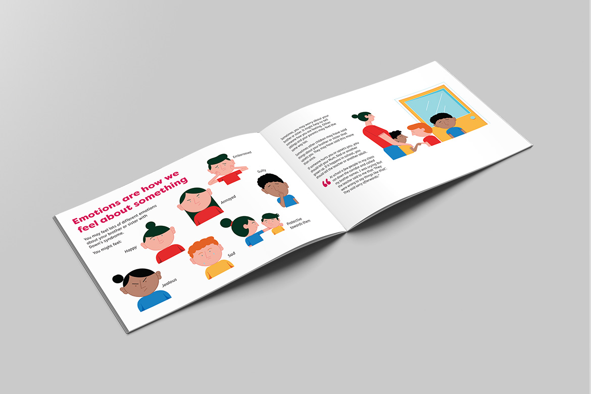
Down's Syndrome Scotland produce a series of publications called 'Lets Talk About'. Most of the series are aimed at people with Down's Syndrome and many of the subjects covered are quite sensitive. Titles include Let's Talk About Puberty, Let's Talk About Periods, Let's Talk About the Menopause and Let's Talk About Death.
Research has shown that people with learning disabilities get more information from a publication if the copy is supported by pictures. Photographs are best, but in many circumstances in the publications previously mentioned that would have been inappropriate. Instead we commissioned the very talented Michael Driver to create us a suite of over 200 pictograms covering every type of subject matter from doing the ironing to how to insert a tampon.
Contact
+44 (0)1786 358 837
+44 (0)7599 281 053
neil@formbythought.com
18 Alpin Drive
Dunblane
Stirlingshire
Scotland
FK15 0FQ
Registered in Scotland
Company Number 546850
VAT Registration No: 444 5792 68
Privacy Policy
Terms and conditions
© Form by Thought Ltd
Registered in Scotland
Company Number 546850
VAT Registration No: 444 5792 68
Privacy Policy
Terms and conditions
© Form by Thought Ltd
Form by Thought
Form by Thought
Form by Thought
Form by Thought
Form by Thought